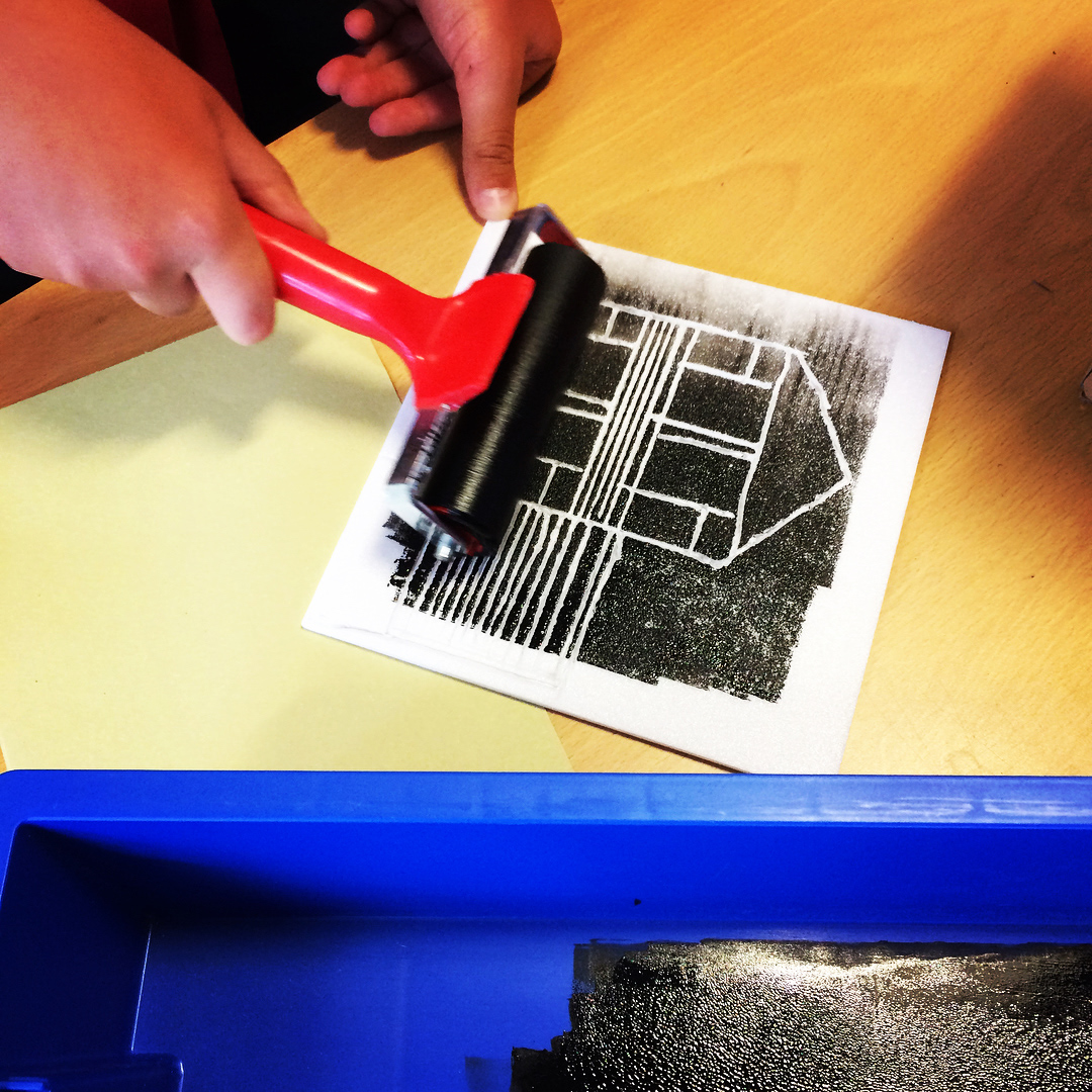
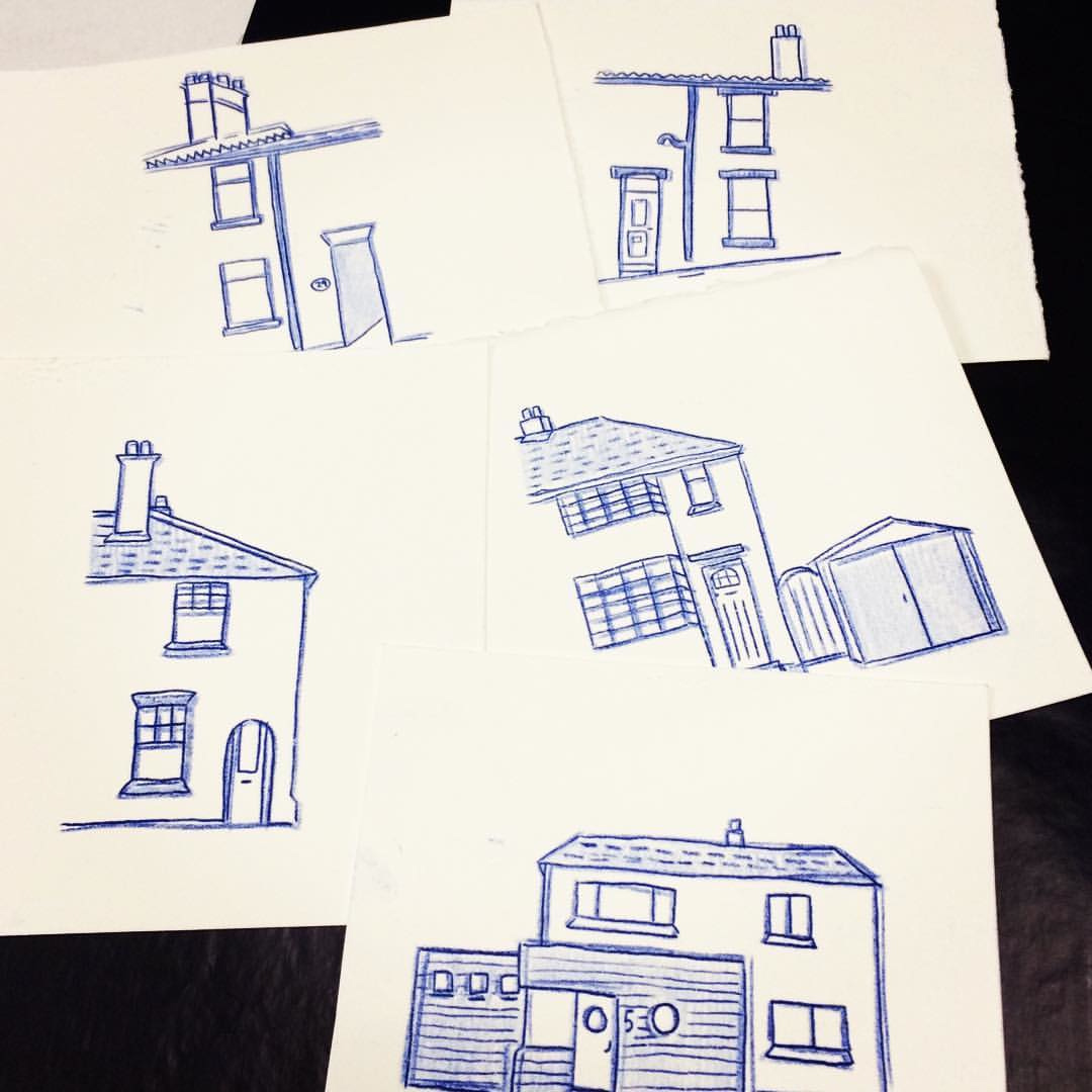
A brilliant afternoon yesterday spent making polyprints of houses with year 4 pupils at Westbury CofE Academy. Using my new book 'home' as a starting point, we made prints of houses, dream homes (including castles!) and shops. So much fun, and really impressive results from classes 4BC and 4HN. Many thanks to the school for inviting me along. The prints will be on display at the school as part of the BS9 Arts Trail this coming weekend. . . .
When we call a place home...
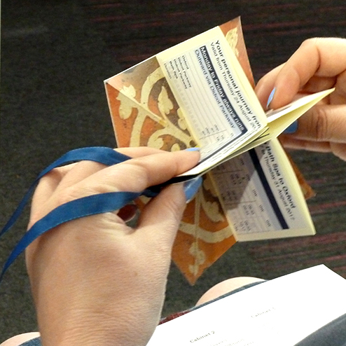
A new book created for an exhibition as part of the Athens Print Fest 2018, on the themes of nostalgia and interruptions.
It is a catalogue of the ten places I have called home – the depictions of these houses represent punctuations in my life. The houses are originally illustrated with carbon paper – a transient medium that fades over time – but digitally reproduced for longevity. The concertina format reflects the chronological nature of the content, and the use of cards and pockets is reminiscent of childhood memories of library books: checking in and out of each place. The visible information (house number, road name and date) is factual, with typewritten personal memories of each place hidden within the pockets. I chose to cover the books with woodchip wallpaper – a common feature in all of my childhood and student homes, and a wall covering I have spent many hours scraping off walls of homes I have renovated as an adult.
I've only finished three books so far, but it will be an edition of 20 (once I can carve out a little more time to make them!)
N is for...
After some procrastination, my latest rubber stamp illustration in my Anglo-Swedish exchange of words collaboration with Swedish artist Eva Hejdstrom. N is for Nickedocka, meaning a puppet and also someone who says yes to everything.
A medieval Show and Tell session
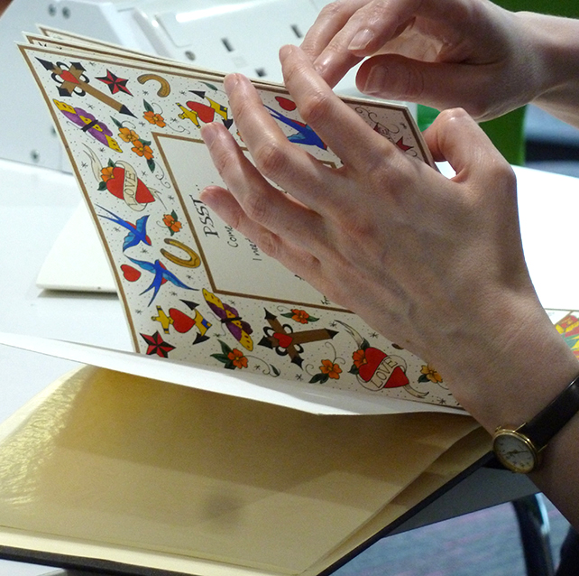
A really fun Show and Tell session for the 'Redesigning the Medieval Book' exhibition at UWE Bower Ashton last Saturday. Twelve participating book artists came along to talk about the inspiration and production processes behind their book. It was also an opportunity to see the books up close and to handle them – always a treat. Still amazed by the diversity of responses to the same brief, and it was so interesting to meet other artists who have been inspired by the same subject matter. Many thanks to everyone who came along, especially Professor Daniel Wakelin who came over from Oxford to join us. Photos by Sarah Bodman, who also helped to organise the session… I'm very grateful to her and the library at Bower Ashton for offering the opportunity for this exhibition to take shape.
Day Pages
A very enjoyable day spent at a workshop run by artist Daniel Lehan - it was accompanying his exhibition 'DAY PAGES' which has just opened at UWE Bower Ashton Library, and inspired by his practice of keeping a daily diary comprising of collage and typewritten text. It was a great excuse to dust off my old typewriter, and also really inspiring to hear about the different ways he collects and creates content for both his diaries and books. The tapping of old typewriters was a soothing soundtrack to the day (not sure other people using the library agreed!)
Redesigned Medieval Books come to Bristol...
Very pleased to announce the opening of the 'Redesigning the Medieval Book' exhibition at UWE Bower Ashton Library in Bristol. The display is an extension of the original exhibition at the Bodleian Library in Oxford earlier this year, and features 40 new books and artworks created in response to the Bodelian's collection of medieval books and manuscripts. I'm very grateful to Professor Daniel Wakelin and all the team at the Bodleian Library for their help in facilitating this extended exhibition, and to Sarah Bodman at UWE and fellow book artist Kate Bernstein for their help and support in setting up the exhibition. It will run from 19 April - 29 June, and there will be an informal 'show and tell' event on Saturday 12 May, 12-2pm, where you can hear some of the artists talking about their books and working process. If you can't visit the exhibition, you can download or view a pdf of the catalogue here.
Riso Birds in Uppercase
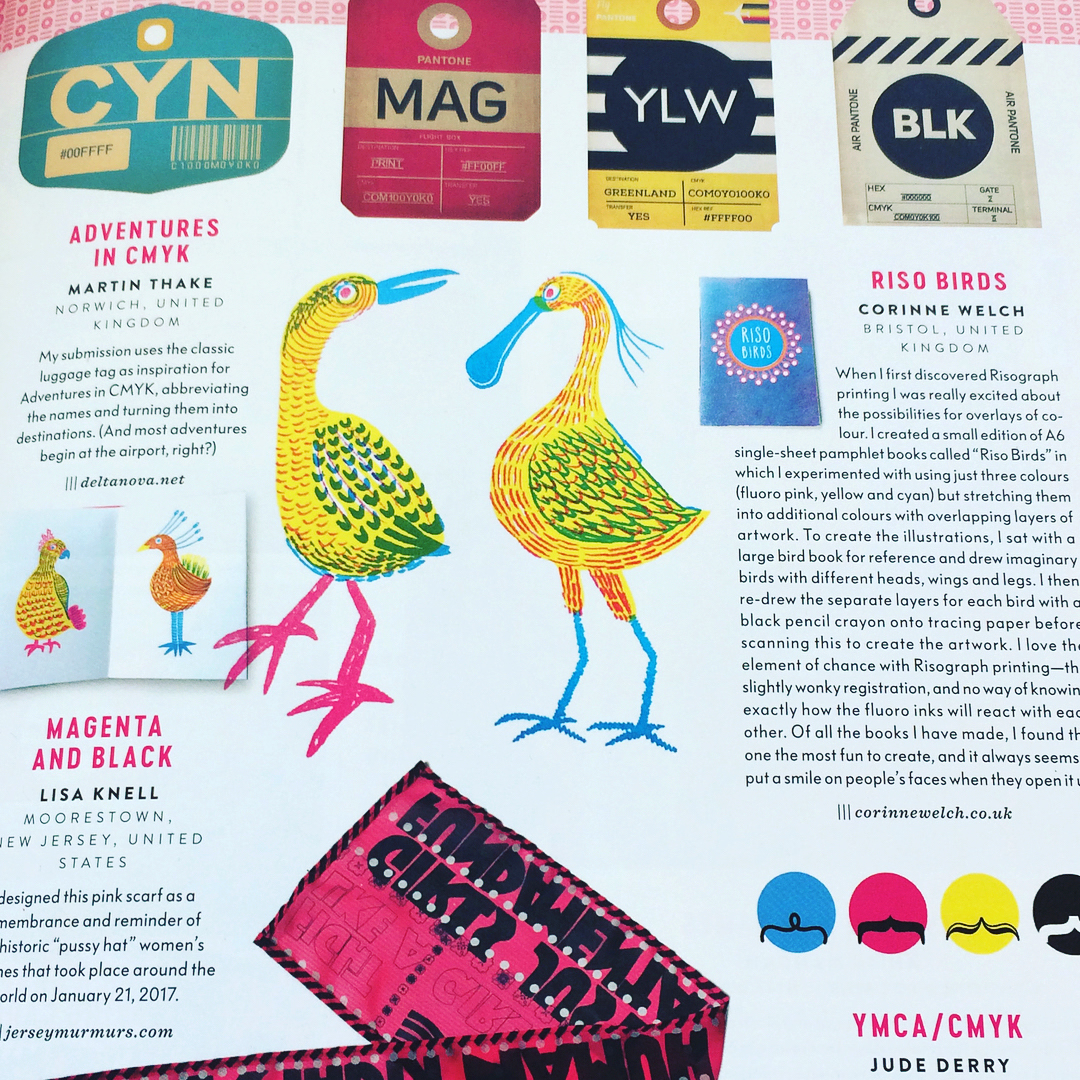
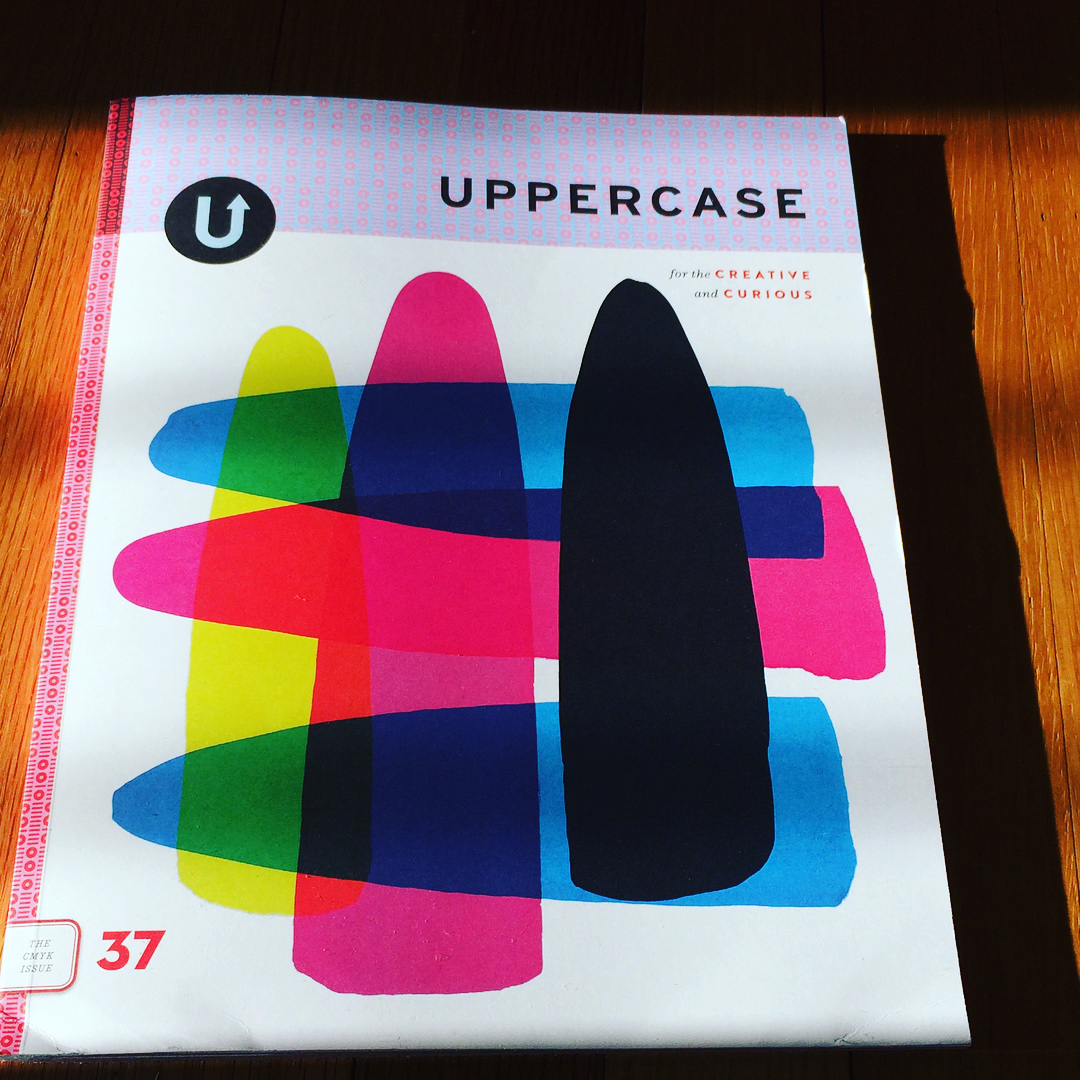
Pretty blimmin’ excited to receive my latest copy of the always-excellent Uppercase magazine... the theme of this issue is CMYK, and features my Riso Birds book! Many thanks to editor Janine Vangool for including these chaps... a real treat to see them on the printed page.
Grand unveiling
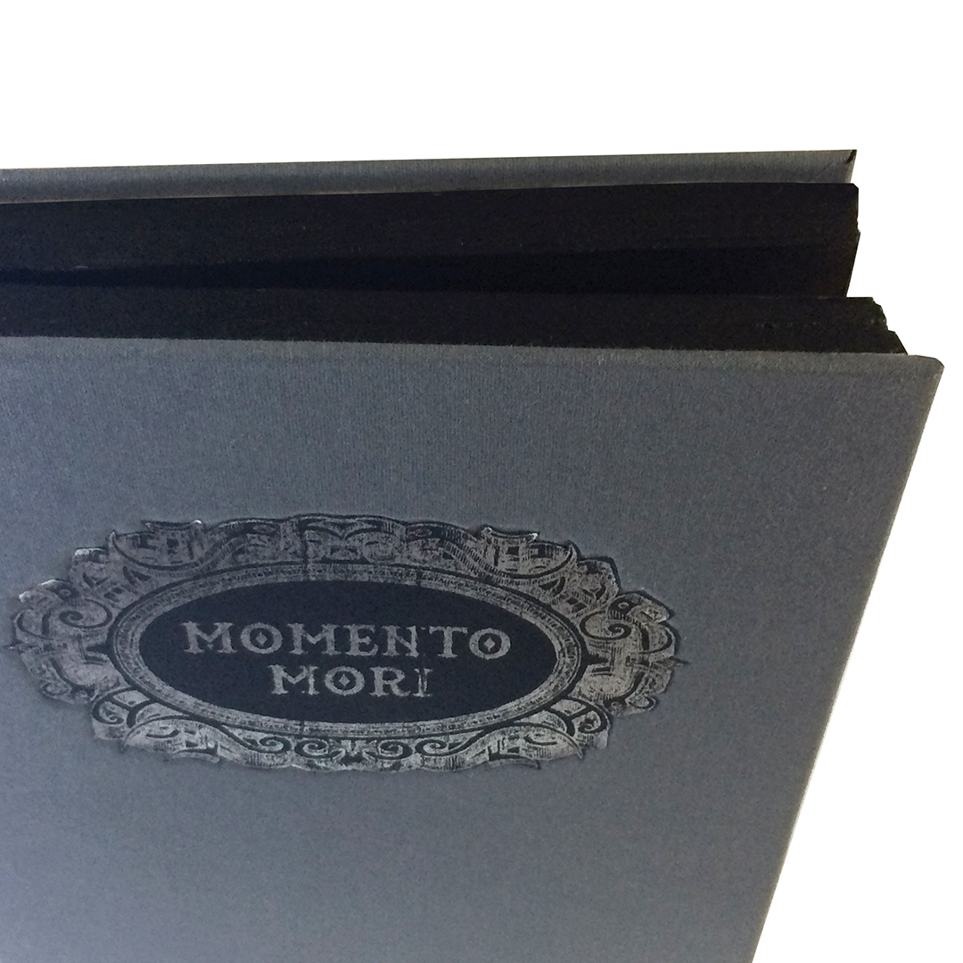
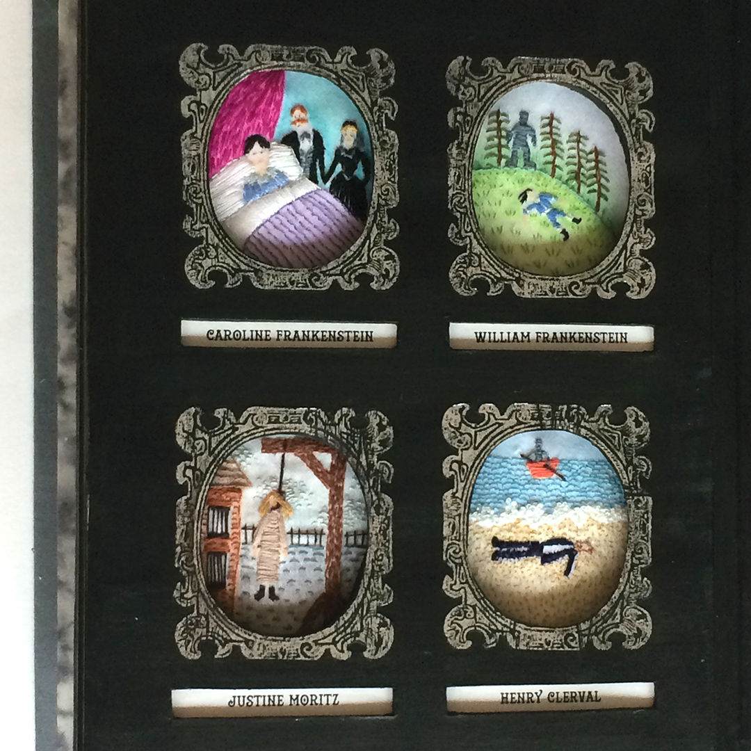
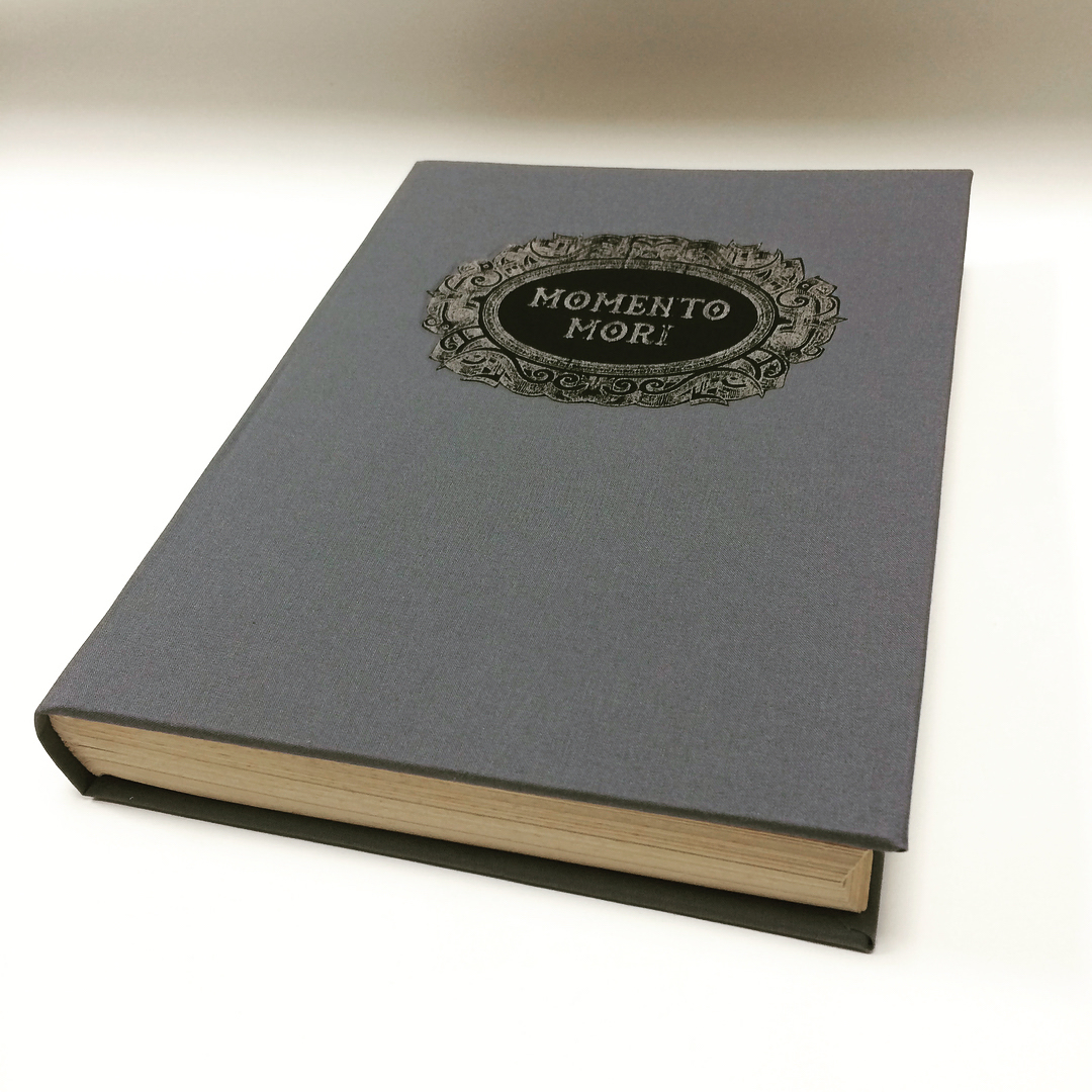
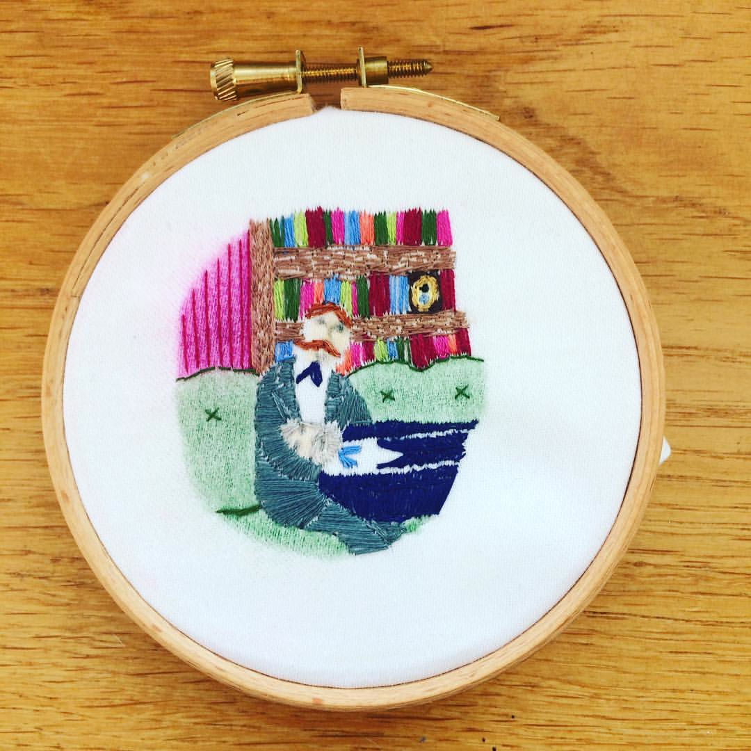
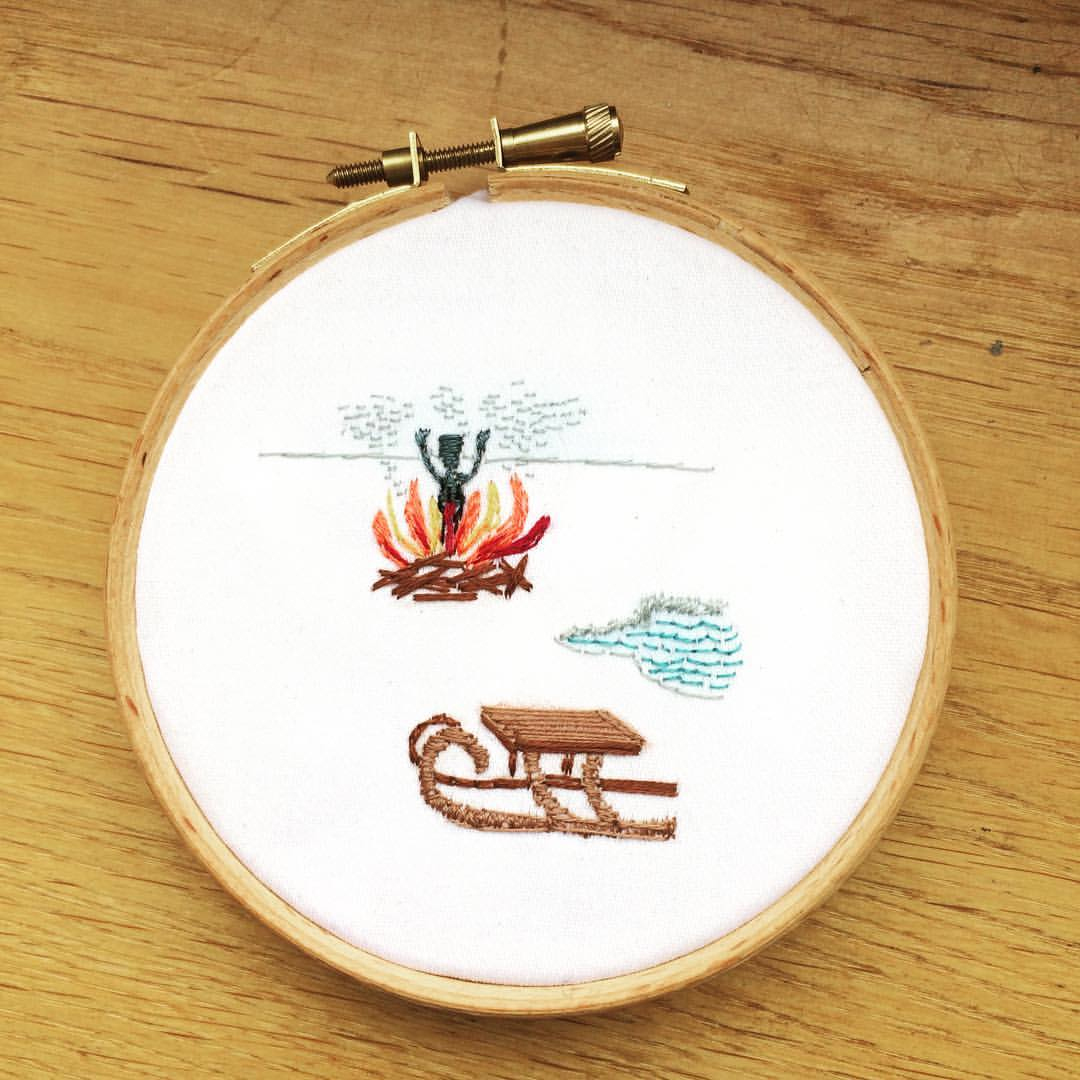
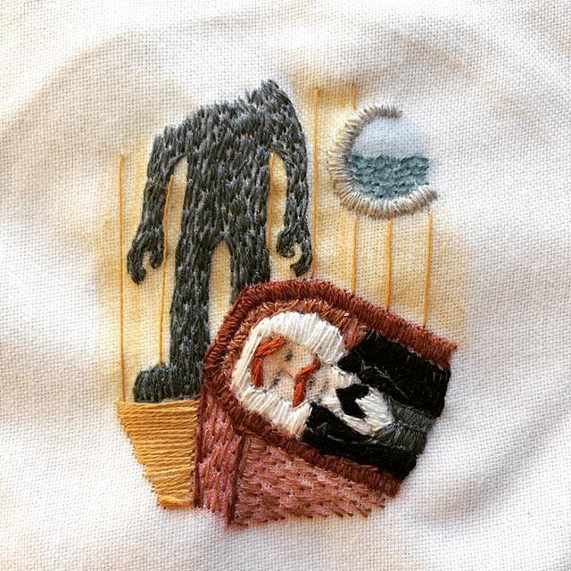
The grand unveiling of my Frankenstein book ‘Memento mori' in all its morbid glory... packaged and sent off to Liverpool Book Art for their exhibition at Liverpool Central Library. Met the deadline by the skin of my teeth. Here's my statement, which hopefully goes some way to explain why I've spent the past three months stitching dead people...
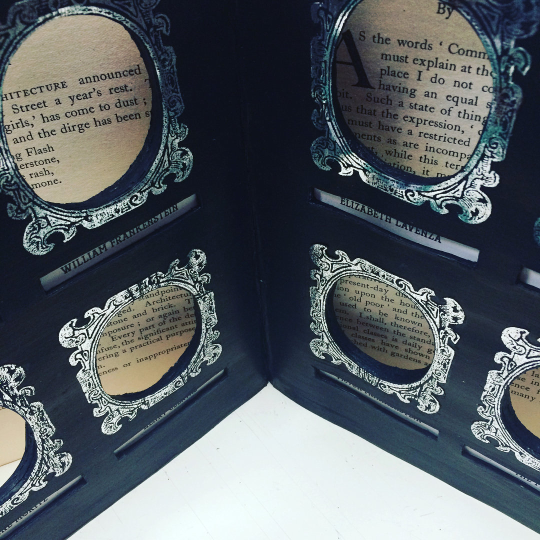
Memento Mori is inspired by the theme of art as a means of remembrance: a recurring motif in Frankenstein. William was carrying a Miniature of his mother, Caroline, before he was murdered, and this then became a defining piece of evidence in implicating Justine. When Victor returns home from university, he is moved by the Miniature of William on their father’s mantelpiece, under a painting of his mother kneeling by the coffin of her dead father. The death of Victor’s mother acts as a powerful catalyst for his experimentation with creating new life, and the memories of his loved ones lost at the hands of the resultant creature lead to his desire to avenge their deaths.
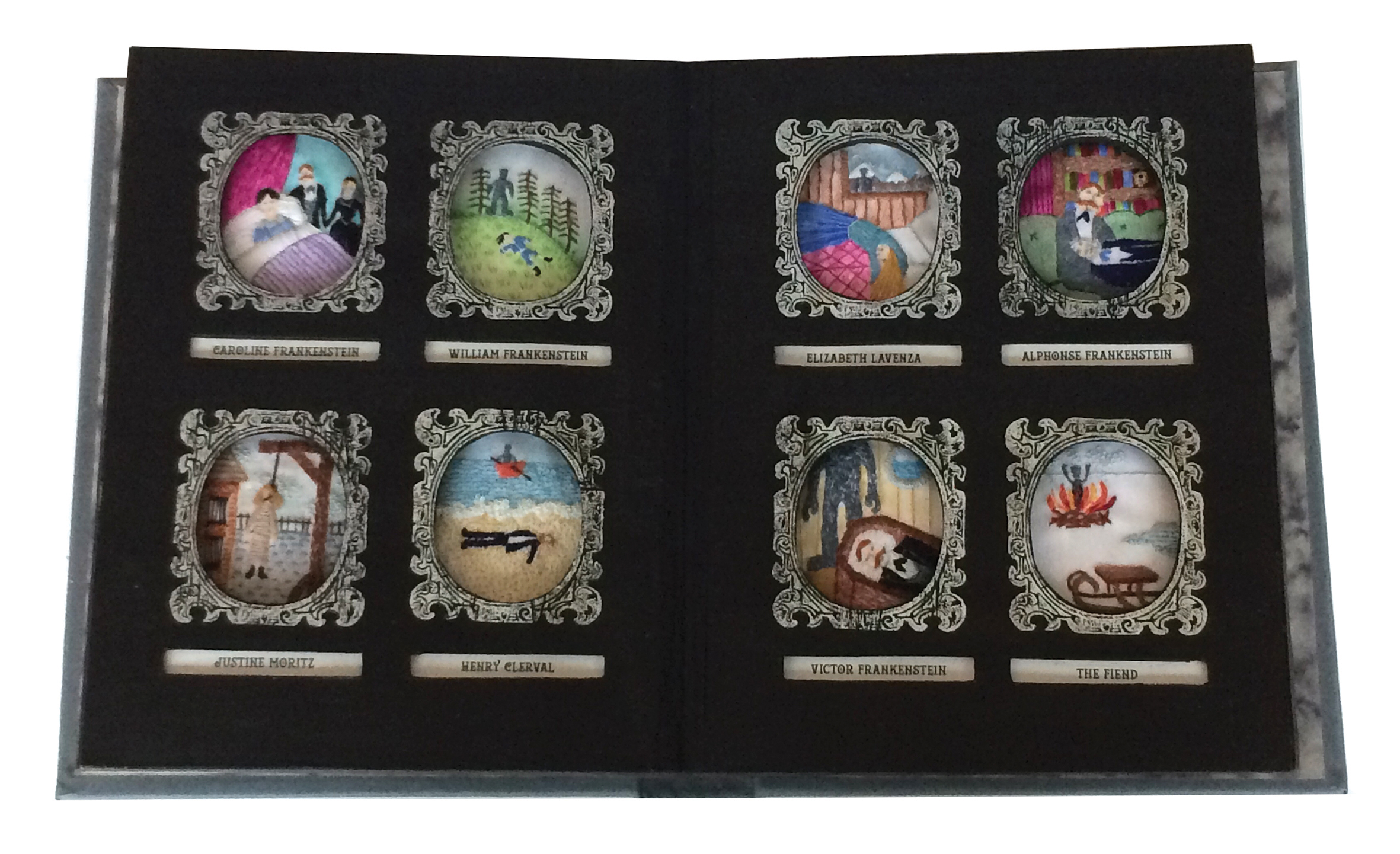
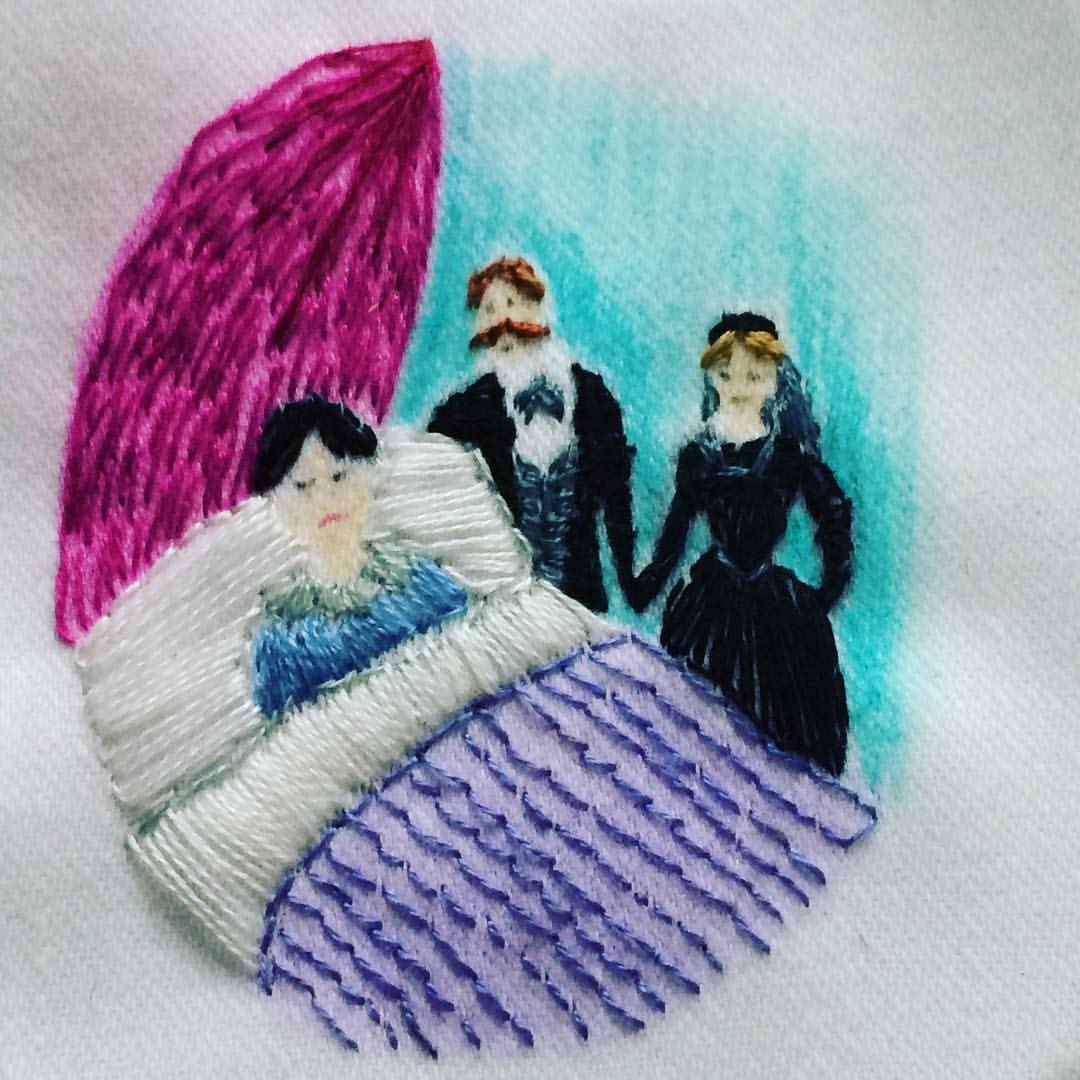
I have altered an existing hardback book and transformed it into a ‘memento mori’ for all the characters who lose their lives. The book has a new cloth hard cover with a foiled title, and opens as a case in two sections. These contain eight framed oval cut-aways featuring embroideries of all of the expired characters (Caroline, William, Justine, Henry, Elizabeth, Alphonse, Victor, and the monster). The embroideries are vignettes of each individual death, each labelled with the character’s name.
I chose to hand embroider the illustrations as the process forms a symbolic act of remembrance, and embroidery was a popular handicraft of the time. The morbid fascination with death in Victorian times, along with the themes of grief, memory and loss in Frankenstein, are reflected in this new work.
Some last-minute hitches
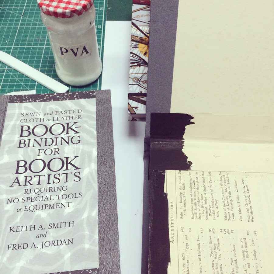
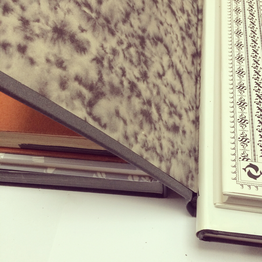
A few final hurdles and technical hitches in binding my Frankenstein book. The perils of making it up as you go along. Very grateful to advice in Keith A Smith’s wonderful book ‘Bookbinding for Book Artists’ and help from my partner, Ian, who is blessed with a technical brain. Saved the day, and the final book is now being pressed. This has been quite a learning curve!
Inking, labelling and framing
Finally ready to mount my Frankenstein embroideries into the altered book. Some things just can’t be rushed (even with a looming deadline!)
Clamping, glueing and cutting
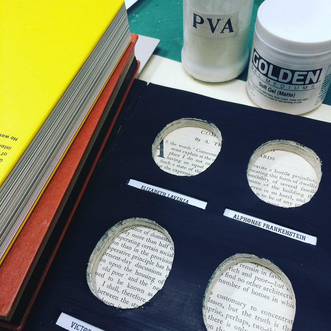
Carving up the book to frame my Frankenstein embroideries. It was bought from the Book Barn for a total of one whole pound, which salves my guilty conscience at cutting up a book. Bit nerve-wracking as I'm not entirely sure if this will work (and I don't have a Plan B) but it’s slowly coming together.
Altering a book for Frankenstein embroideries
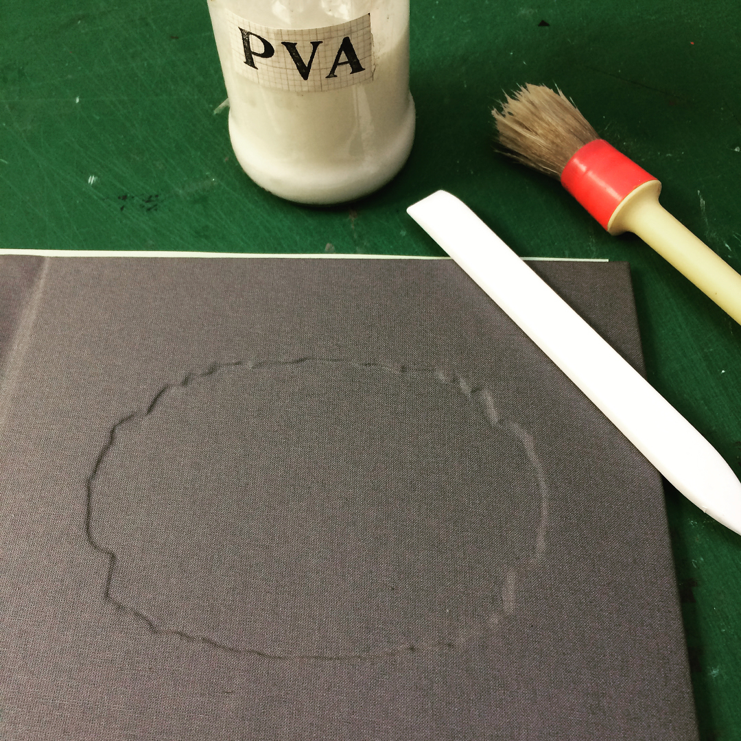
Recovering an old book cover to make a case for my Frankenstein embroideries. I added an inset panel for the title block, covered the boards in grey bookcloth, then added the laser foil-blocked title.
Stitching complete
Pinning out the final trimmed embroideries for photographing...
Memento mori (part two)
A rather belated post to show the remaining embroideries for my Frankenstein book.
Memento mori (part one)
Stitching furiously to meet the April deadline for my submission to Liverpool Book Art's Frankenstein exhibition. I'm working on a book that will open to reveal eight embroidered vignettes of the deaths of the characters in Mary Shelley's Frankenstein. I was inspired by the recurring motif in the story of using art to remember the dead, and Victorian society's morbid fascination with death. I hope to reflect the the themes of grief, remembrance and loss in my final book. In the meantime, I'm finding it strangely enjoyable embroidering dead people. Each to their own.
Drawing more plants (and twigs)
A new year's resolution to draw more plants has got off to a slow but enjoyable start, with a slight diversion into twigs...
L is for långtifrån
Latest illustration in my Anglo-Swedish exchange of words collaboration with @eva.hejdstrom ... långtifrån, meaning ‘far from’ in Swedish.
One mouse-chewed magazine
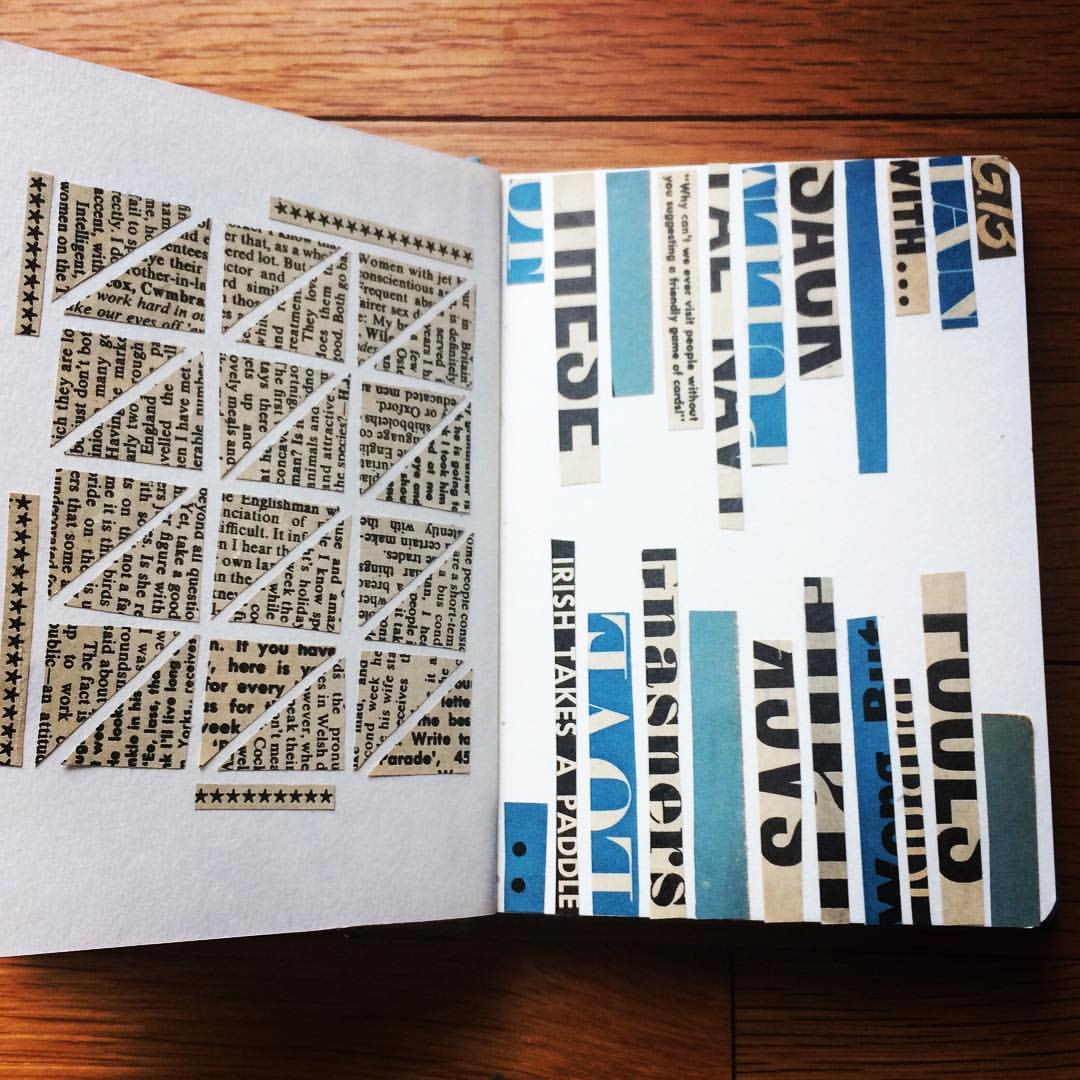
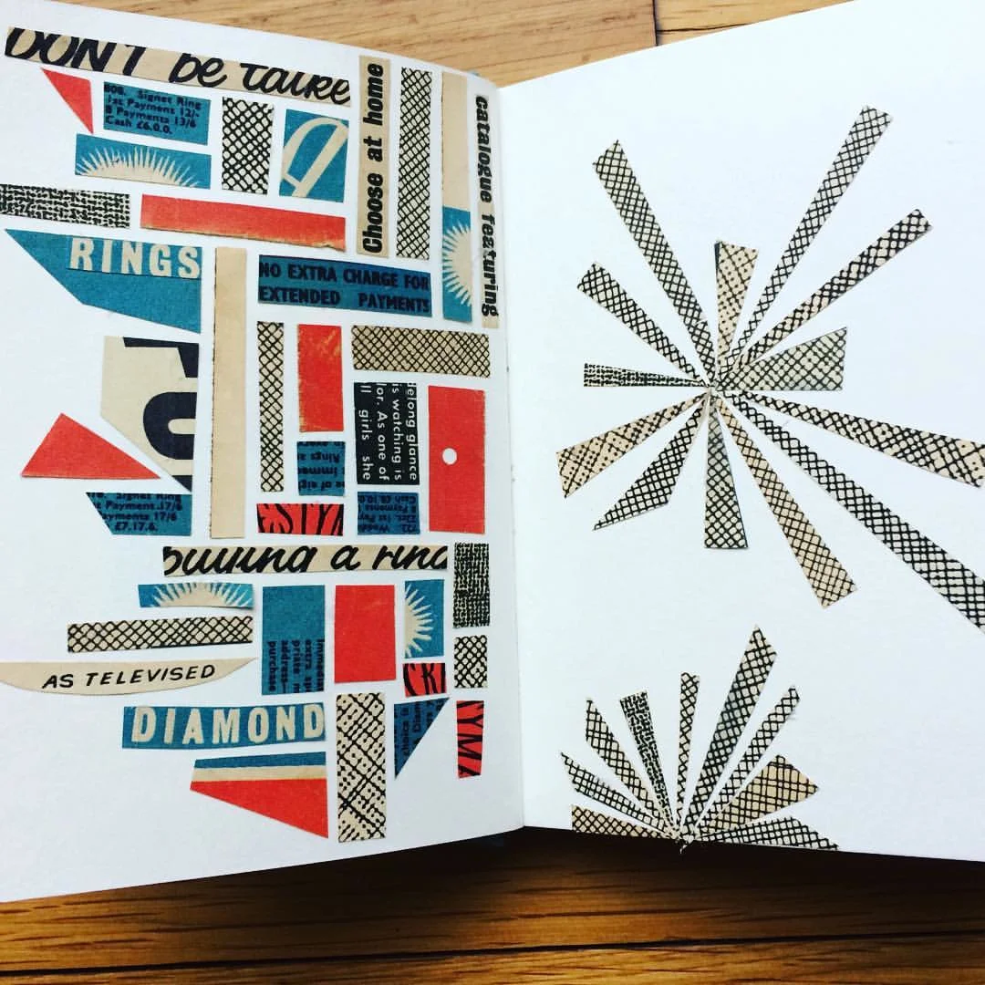
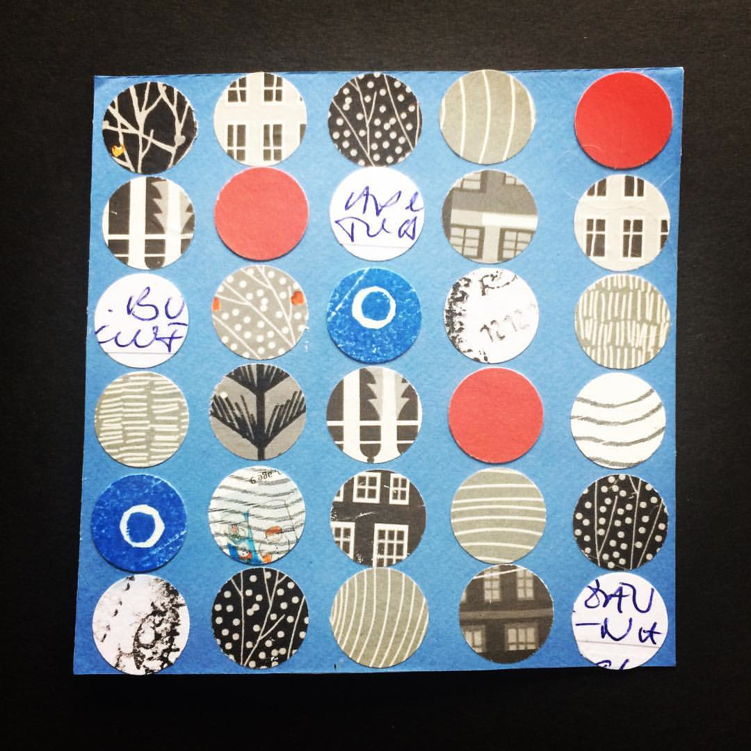
Clearing out the garage over the festive break I came across a 1960's magazine which had been chewed by mice. As a spin-off from my recycling collage challenge, I decided to see how many different collages I could make from it. Some are in the square format as the recycling collages and others are in my sketchbook… amazing colours and typography. Very grateful to the mouse for giving me permission to chop up something I would otherwise have just filed away!
K is for Kip
K is for Kip – a short sleep or nap. The latest rubber stamp illustration in my exchange of words collaboration with swedish artist Eva Hejdström.
Collage challenge continues
A busy start to the year with work, so I'm a little behind with blog posts… I've been carrying on with making collages from paper rescued from each week's recycling box. It's turning into quite a mixed bag of a project so far...